Decades ago when people wanted to browse, listen to and purchase music they had to leave the comfort of their home and journey miles away to a large department or specialty store to do so. One of the ploys used by stores to entice shoppers was naming the departments creatively. In some instances the music section was called the Record Bar (a practice that existed prior to the store of the same name). It was a way of differentiating the music department from the staid sections of necessities like shoes and clothing and implied luxury and fun. Hanging a sign that just read “Music Department” was too boring even though over the years stores have returned such naming simplicity even if made in flashing lights or neon. Calling a corner of a department store containing alphabetized shelves of long playing records a “Record Bar” promises fun, excitement and possibly illicit nightclub acts.
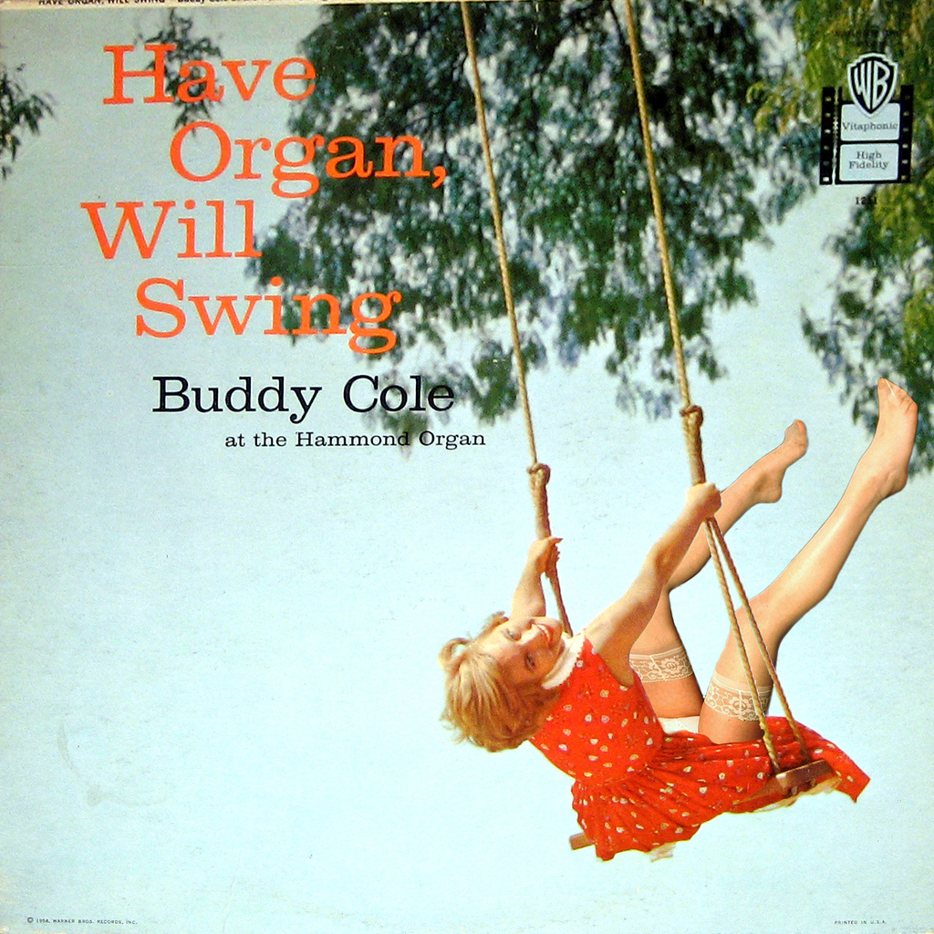
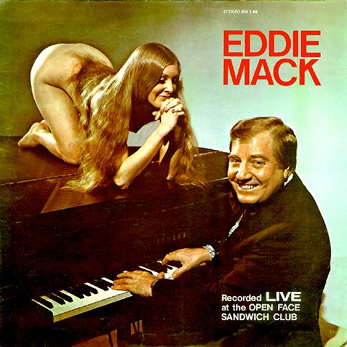
Other than branding a department in exciting ways what most promoted sales of LP’s is the usually fascinating and sometimes lurid cover art. The 1950s and 1960s were famous for their cover disconnects, where the artists cleverly relied on sexual imagery to boost sales of polka or lounge music. The greatest disparity in using sex to sell LP’s occurs in those categories of music that one doesn’t normally associate with fun times and parties such as highway motel lounge ensembles, nightclub musicians and organ soloists.
 While enough people went out to such places to justify employing them for a few decades no one really wanted to buy their music and take it home with them. Drinking a highball after a hard day of selling reverse-threaded screws to gas stations while decompressing in the orange and aqua booth of a Howard Johnsons doesn’t usually make one wistful for the musical stylings of the guy at the piano that has a mop and bucket in view leaning against the turquoise burlap-covered wall behind him. Those purchases were typically reserved for the headline and more heavily promoted and polished acts that were marketed at the national level. So when browsing the aisles of the Record Bar the tired serf of the Camelot lifestyle had to be promised wild parties and lewd play times by way of a woman with large breasts who worships the man who plays the organ at the local park pavilion on alternating Saturdays.
Gilligan at Retrospace (from whom I ganked a few images) exhaustively details the practice of using sex to sell music and other products. Click the link to check out his entry on Cheesecake Album Covers. He hosts many fine examples and even more links to consumer-baiting LP covers.
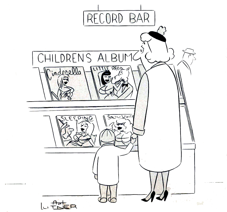
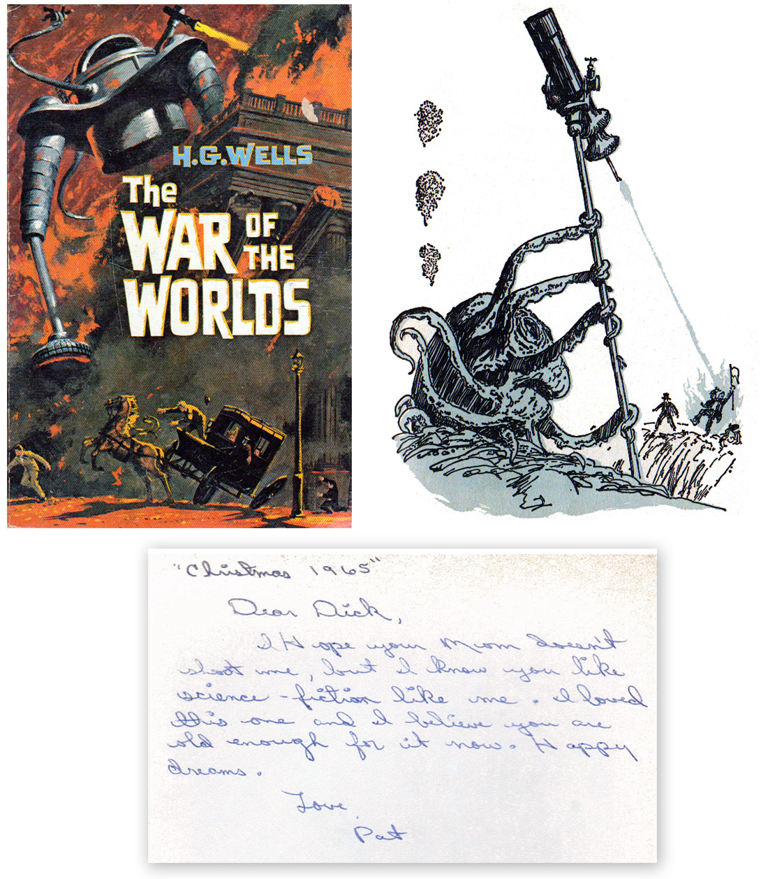
The following cartoon by Art Lutner from Bachelor #2 (1961) is a good example of the logical progression of the use of sexual imagery to sell records and would have rung true with most readers of the era.
 While Lutner was making a comical statement about using sex to sell children’s LP’s he wasn’t far off from reality. Quite often advertising for children’s products is aimed at the adult who holds the money and has little to do with the content of the purchase.